Tomek Stolarczyk

Senior UX/UI Designer

Tomek Stolarczyk

Senior UX/UI Designer

Tomek Stolarczyk

Senior UX/UI Designer

Tomek Stolarczyk

Senior UX/UI Designer

eFitness

Wellness Management SaaS (2024)

Project's Scope

Product Design, UX/UI, Prototyping, Design System


Overview


eFitness is the biggest Polish SaaS platform for fitness facility management. Their team concluded that some of the features on the platform require a complete UX redesign in order to align with the needs of their biggest core clients. On top of that, they wanted to refresh the UI of the entire platform along with it.


I had the pleasure of being the designer in charge of both of those processes taking over the project at the stage of wireframes-making for the new UX of the calendar feature. I managed the rest of the work until the final UI was finished and passed over to the development squad.
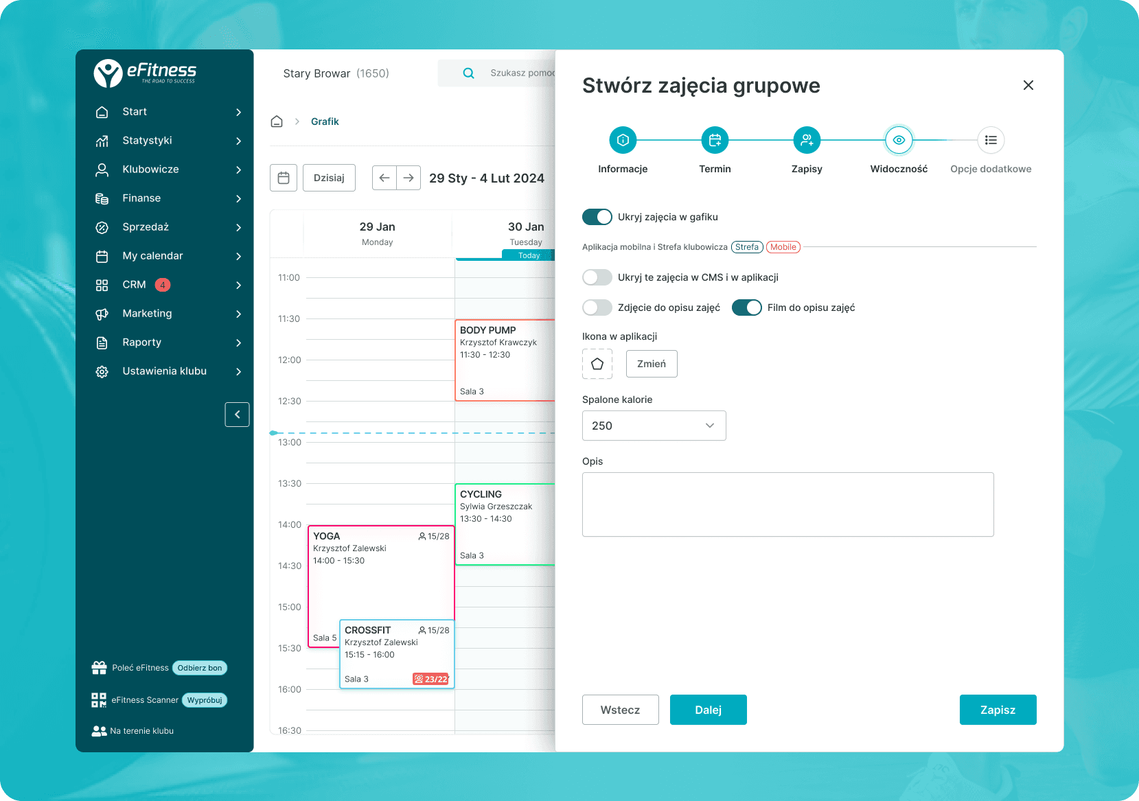


From wireframes…


The project started with creating high-fidelity wireframes that defined a new user flow that eliminated a lot of UX errors along the way that complicated the user's journey in the previous version. The first iteration consisted of creating a variety of views of the calendar feature where the user can manage all the exercises that takes place in a given club. As well as allowing the user to use all the configurations of it in a simple and sorted manner. On top of that, the user was meant to be able to create new events and edit the existing ones.


The tricky part was that in the new version, we wanted to implement a possibility of bulk-edit where many different events can get changed all at once to save the time of core customers who have to deal with big numbers of them.


Together with another Senior Designer who began this stage prior to my arrival, we ended up creating a total of 55 wireframe screens that defined the new user flow.
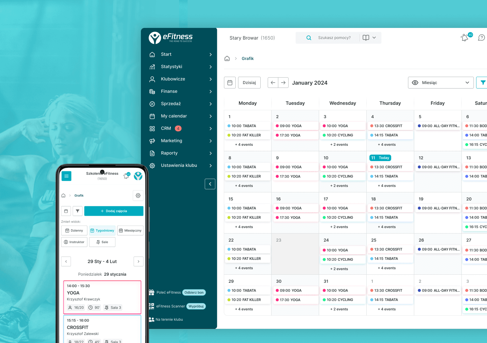
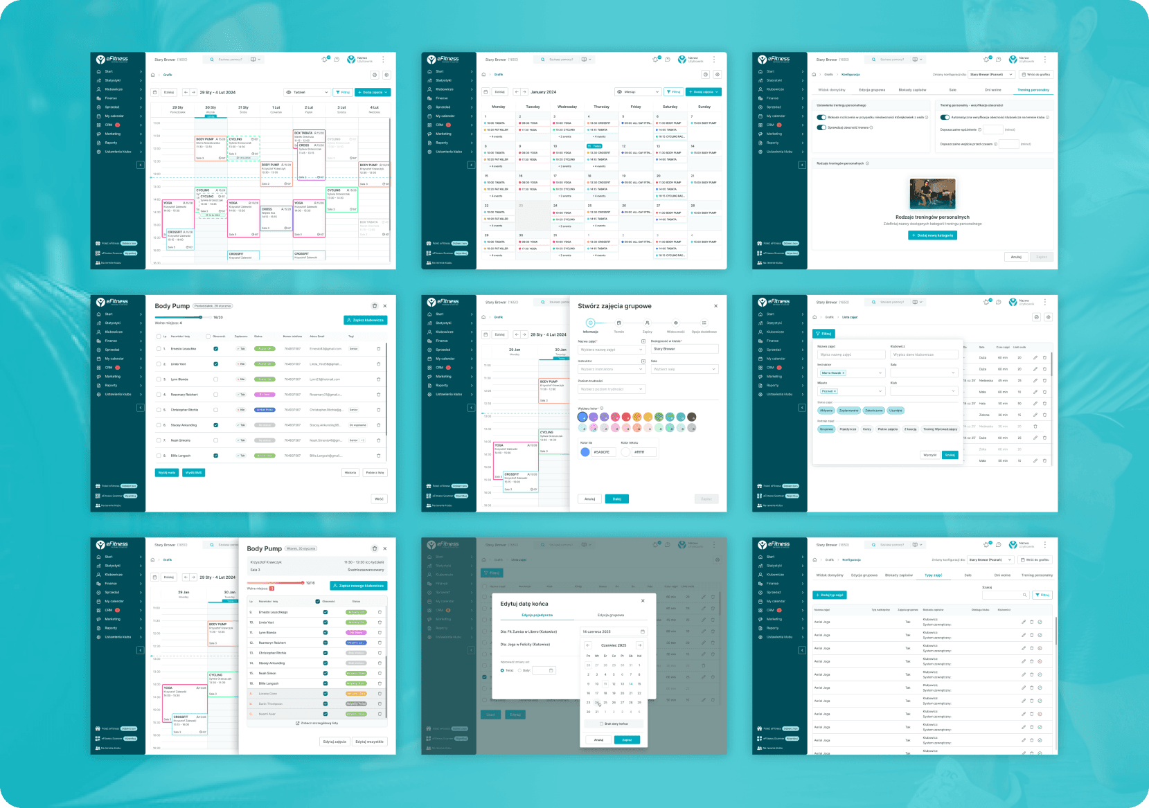

…to brand new user interface


Once all the wireframes got approved by the given stakeholders and we all had full confidence that the best possible user journey had been defined we started to transform the design into the final UI.


Along the way, I have audited some of the most important UX/UI elements and submitted my recommendations for global changes on the platform seeing that, for example, the color palette lacked consistency in some areas. And the CTA buttons lack required contrast and hover states were poorly defined.


A big part of the UI stage was re-defining and adding new interactions to different platform elements such as more visible hover states, and hover-sensitive tooltips. That way the platform will begin to feel more alive and create some "wow" effects despite its minimalistic look oriented toward a spotless user experience.


We managed to complete both of those stages within the time and budget estimated at the beginning of the project.


A clickable prototype and user testing


The next stage of the project includes creating a clickable prototype of the platform that has been presented to existing users of the platform to verify if the user flows are comprehensive and gather feedback that was then used to apply final adjustments before the development stage begins.