Tomek Stolarczyk

Senior UX/UI Designer

Tomek Stolarczyk

Senior UX/UI Designer

Tomek Stolarczyk

Senior UX/UI Designer

Tomek Stolarczyk

Senior UX/UI Designer

Tillio

Business Management SaaS (2023)

Project's Scope

Logo Design, Branding, Web Design, UX/UI, Product Design, Sales & Marketing Design


Overview


Tillio is a new CRM system for business management. The founder partnered up with me to define a new brand and create a new website that will generate new leads and convert them into paying users.


Being the only designer on board I was in charge of the entire project's scope and process. We managed to finish everything within the discussed deadline and budget. And when phase #1 finished we ended up extending the website from 14 to +25 subpages.


Research phase


The most interesting phase of my research was defining the brand's color palette. I have checked over 70 most popular CRM brands to find the perfect fit that would help us stand out from the competition.

The results have shown that over 60% of the logos are blue and green. There was also a large group of orange/yellow brands taking around 30% of the market. This defined two roads:

  1. Following the market's best practices and use one of the above colors to fit in.

  2. Define a different color that will make the brand stand out from the competitors' crowd.


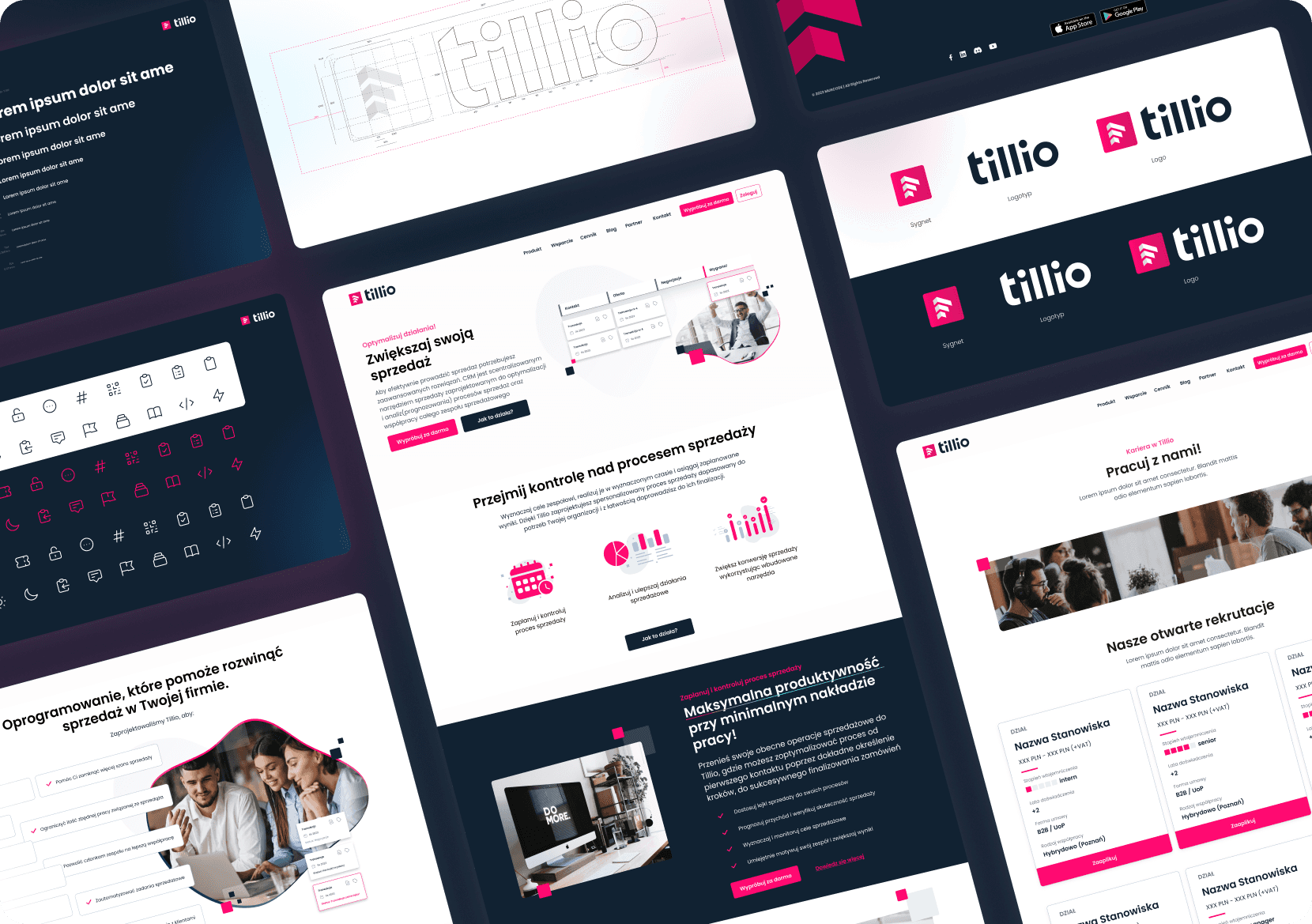
We have decided to go with the latter and defined the primary brand's color as magenta. It was supplemented by a secondary color, a very dark blue tone, that would give us a good contrast and a more serious business look.


Web design


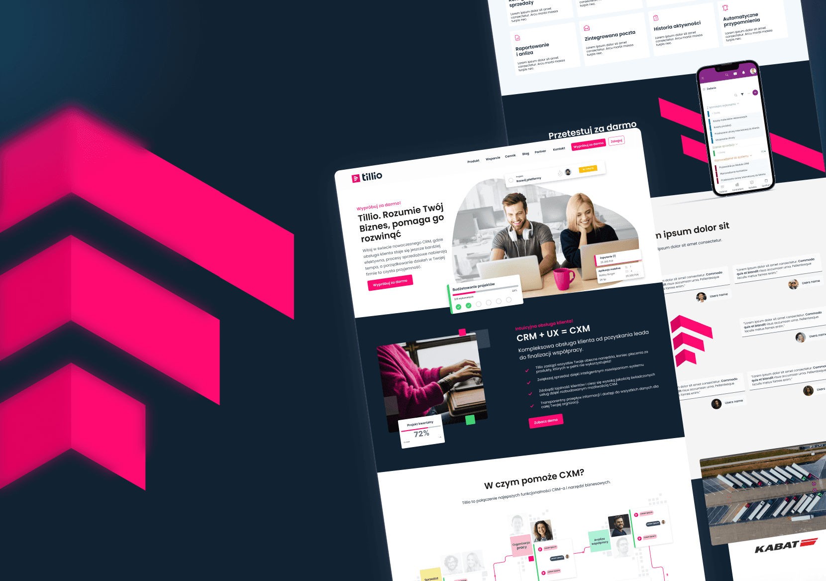
The web design phase was the biggest part of the project. We ended up creating over 25 subpages and the results can be seen at tillio.pl

The entire scope consisted of:

  • Main page

  • Various subpages and landing pages defining specific features and aspects of the platform

  • Pricing page

  • Career page

  • FAQ

  • Knowledge base

  • Blog

  • Contact page


UX/UI design


Another part of the project was designing some Product (UX/UI) Design elements. We have created the login and registration processes for both desktop and mobile. As well as a user's dashboard used for maintaining and adjusting the accounts. We also adjusted the existing CRM platform stylistically to align with the new brand.


Sales & Marketing Design


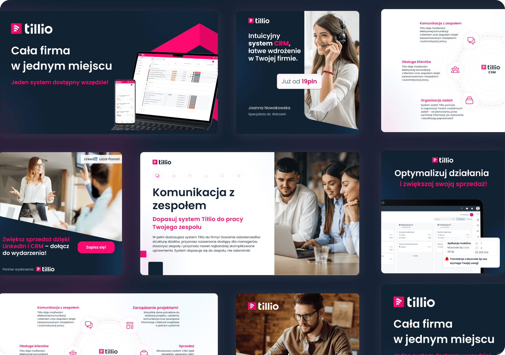
Lastly, we worked on the design for the sales & marketing materials that the Tillio team is going to use while hunting its new users.

I have suggested that I create a design system and templates in Canva. That way, we automate many aspects of the future design-making process. Their marketing team can use those materials for multiple purposes with very little to no need to have any designer present and help them with it.